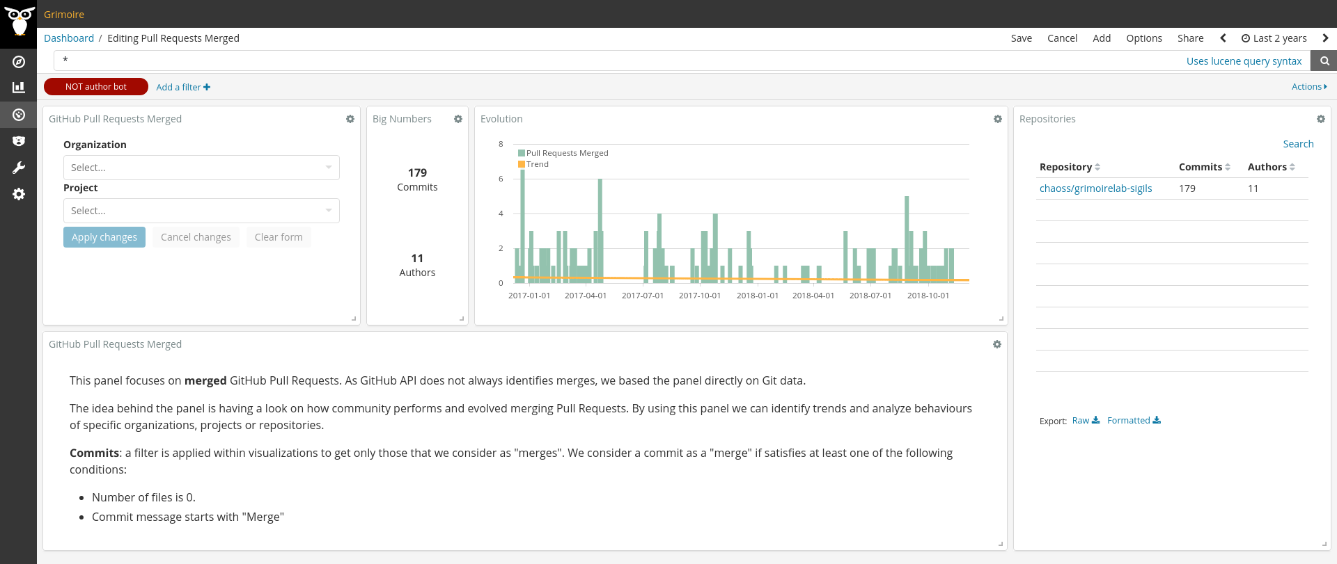
Pull Requests Merged
This panel is focused on metrics related to Pull Requests merged. As GitHub API does not always identifies merges, we based the panel directly on Git data.
The idea behind the panel is having a look on how community performs and evolved merging Pull Requests. By using this panel we can identify trends and analyze behaviours of specific organizations, projects or repositories.
Why we rely on Git instead of GitHub data
GitHub API give us information about pull requests merged from the interface or the command line. However, there are some cases in which GitHub is unable to identify a merge. The usual case is a merge done after rebasing through the command line. In that case, GitHub has no way to identify the merge (see for instance the following Pull Request that was already merged: Sigils#297). For that reason we decided to build a panel relying directly on Git data, using some basic filters to identify merges. If merges follow an homogeneous pattern, it should be possible to identify them by filtering. This could be not 100% accurate, but it is reasonably flexible to be updated to specific communities or repositories.
How we identify a commit as a merge
A filter is applied within each visualization to get only those commits that we consider as “merges”. We consider a commit as a “merge” if satisfies at least one of the following conditions:
- Number of files is 0.
- Commit message starts with “Merge”
List of metrics provided on the panel
- Number of commits: number of commits identified as merges in the whole time range selected.
- Number of authors: number of authors of those commits.
- Evolution of Pull Requests merged: evolution of number of commits during the selected time range.
Filtering by Organization and Project is allowed by using the top left corner widget.
Number of commits and number of authors are shown next to filtering widget. These are global numbers to have an idea about the amount of data we are visualizing with current filters. These metrics are also shown at the right hand side, within repositories table. This provide a quick and comparable view of each repository.
Evolution of Pull Requests merged is almost centered in the panel, between global numbers and repositories table. Each bar shows the count of merged Pull Request in a particular time frame (depending on the period selected in time picker, on the top right corner, it could be minutes, days, weeks, months, etc.). Yellow line represents the trend corresponding to the bars providing an insight on the current status of merges for the active filters. The meaning of the trend could strongly depends on how the data is filtered. For example, if we are looking at a new repository only, we could expect having a positive slope, as community is probably getting bigger and number of contributions increase. On the other hand, an old repository could have a negative slope just because it raised its higher peak some time ago and now it travels towards stability. Finally, global numbers for an heterogeneous set of repositories could lead us to a stable trend because of the combination of the different behaviours from different repositories.
Finally, a short text is shown at the bottom to explain the basics needed to understand the panel.
Files
To use this dashboard with your own GrimoireLab deployment you need to:
- Check
gitindex is available on your GrimoireLab instance (see grimoirelab-sirmordred documentation for details on how to deploy it). - Import the following JSON files using Kidash tool.
| Index Pattern | —– | Dashboard |
Command line instructions
Once you have the data in place, if you need to manually upload the dashboard execute the following commands:
kidash -e https://user:pass@localhost:443/data --import git-index-pattern.json
kidash -e https://user:pass@localhost:443/data --import pull_requests_merged.json
Edit this doc