Engagement: Contributions overview
This panel is focused on analyzing engagement in terms of contributions, providing an insight of projects receiving most contributions and allowing to identify both general and more specific trends related to particular data sources, organizations or projects.
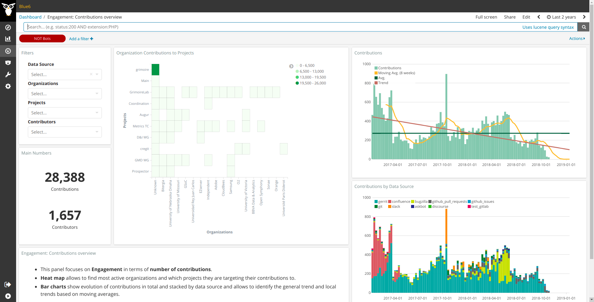
Metrics
From left to right and top to bottom, the metrics provided are:
- Main Numbers: total number of contributions and contributors.
- Organizations Contributions to Project: heat map showing top organizations and projects they contribute to. Dark colors indicate those points of high engagement.
- Contributions:
- Each
barshows number of contributions per week for the time frame selected in time picker (top right corner of the page). Red linerepresents the trend corresponding to the bars, providing an insight on the current status of contributions for active filters. The meaning of the trend could strongly depends on how the data is filtered. For example, if we are looking at a new project only, we could expect having a positive slope, as community is probably getting bigger and number of contributions increase. On the other hand, an old projects could have a negative slope just because it raised its higher peak some time ago and now it travels towards stability. Finally, global numbers for an heterogeneous set of projects could lead us to a stable trend because of the combination of the different behaviours from different repositories. Data source also affects the trend, as new sources could show a higher activity than older ones or we could have some deprecated ones, in process of being substituted by others, with decreasing activity levels.Orange lineshows moving average which allows to identify trend changes by looking at the points where contribution bars crosses this line.Dark green lineshows the average number of contributions for the whole period shown in the chart.
- Each
- Contributions by Data Source: same data as shown in Contributions chart bars above, split by data source in order to ease finding those sources that may be interesting to analyze individually. It also allows to identify which sources are biasing results in case we want to filter them in or out.
In addition to Kibana filters and search box ont top, filtering by Data Source, Organization,
Project and/or Contributor is allowed by using the top left corner widget. Notice the red
filter on top used for excluding bots.
Files
To use this dashboard with your own GrimoireLab deployment you need to:
- Check
all_enrichedindex is available on your GrimoireLab instance (grimoirelab-sirmordred automatically creates this alias for you). - Import the following JSON files using Kidash tool.
| Index Pattern | —– | Dashboard |
Command line instructions
Once you have the data in place, if you need to manually upload the dashboard execute the following commands:
kidash -e https://user:pass@localhost:443/data --import all_enriched-index-pattern.json
kidash -e https://user:pass@localhost:443/data --import engagement_by_contributions.json
Edit this doc