Git Demographics
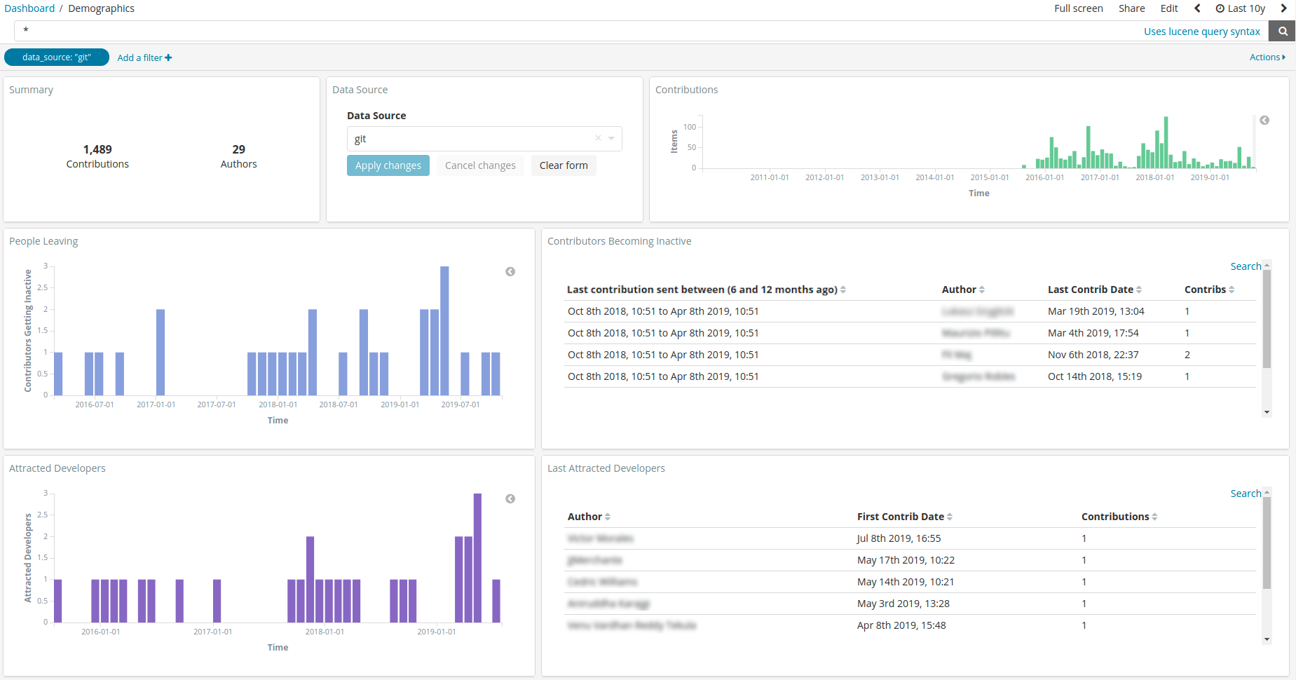
This panel focuses on the attraction of developers and those leaving the community. There are two main charts where you can filter the information and these are the bar charts.
The first bar chart on the top displays the amount of developers that committed their first commit in that period of time. While the bar chart below this one groups developers by their last detected commit. Thus, the first bar chart provides information about how the community is attracting developers while the second bar chart provides information about the evolution of the people leaving the community.
This panel is intended to be used with the whole history of the community activated and not with some pre-established timeframe of activity as in other panels (for instance, 2 years). This is done in this way as the information pre-calculated and displayed focuses on the first and last commit of each developer.
The rest of the widgets, such as the repositories, organizations or projects are mere informative widgets and shouldn’t be used to filter information. It is worth mentioning that when clicking on any of them and a filter is enabled, the information displayed is not filtered as it is usually done in Kibana. Let us imagine that the filter by a repository X is enabled. This panel would show the attraction/retention/developers leaving the community that at some point participated in such repository. However, this does not display the specific attraction/retention/developers leaving rate for that repository.
As the information is pre-calculated per developer and not done on-demand by Kibana, this forces to use this approach.
In addition to this, the rest of the widgets on the left side of the panel displays information about the recently attracted developers and those that recently left the community six months ago (so committed their last change six months ago). The selection of six months as the period to define a developer as inactive is based on our own experience measuring open source communities. Each community may have their own peculiarities that may vary this approach, but in general this has been a good indicator up to now.
There is a known issue that may affect the readability of the panel: when a developer has been detected as committing her first piece of code in 1970. This is a problem of the analyzed Git repository that contains that information, but also in the cleaning process of the Grimoire infrastructure. This data-issue provokes that the information for such developer for her first commit took place in 1970, and this is clearly wrong. Those commits should be ignored or updated to a real timeframe of activity at some point. If you see this behaviour in the dashboard, please report this as a bug.
Files
To use this dashboard with your own GrimoireLab deployment you need to:
- Check
gitindex is available on your GrimoireLab instance (see grimoirelab-sirmordred documentation for details on how to deploy it). - Check the demography study is active. Look for
[enrich_demography:git]in your sirmordred’ssetup.cfgfile. - Import the following JSON files using Kidash tool.
| Index Pattern | —– | Dashboard |
Command line instructions
Once you have the data in place, if you need to manually upload the dashboard execute the following commands:
kidash -e https://user:pass@localhost:443/data --import git-index-pattern.json
kidash -e https://user:pass@localhost:443/data --import git_demographics.json
Edit this doc