Edit a visualization
In order to edit a visualization and save it, you need to be logged in.
- Steps
Note: Refer to how to create a visualization to understand the editing interface.
How to change the color of visualizations
Some visualizations make use of graphs, charts and tables to represent data. In order to represent the different data, several contrasting colors are used.
- Steps
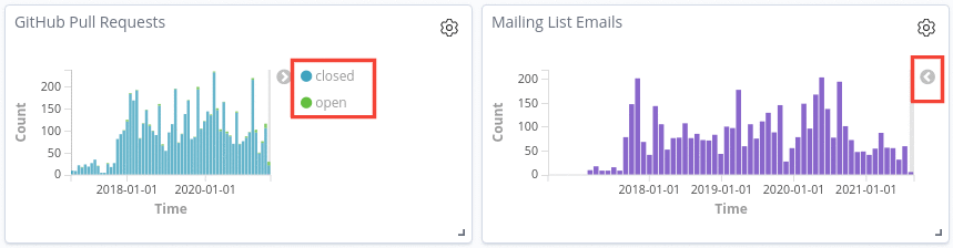
- Find the panel in which you want to change the color.
-
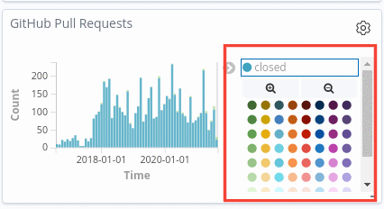
Every panel that makes use of colors will have the sample color and the data it represents on the right side of the panel. In the case it is not visible, click on the arrow key on the right side of the panel.
-
Once you’ve clicked on the sample color, a palette of colors will be displayed. You just have to choose your preferred color.